Hill & Company
Oklahoma City, OK
2015
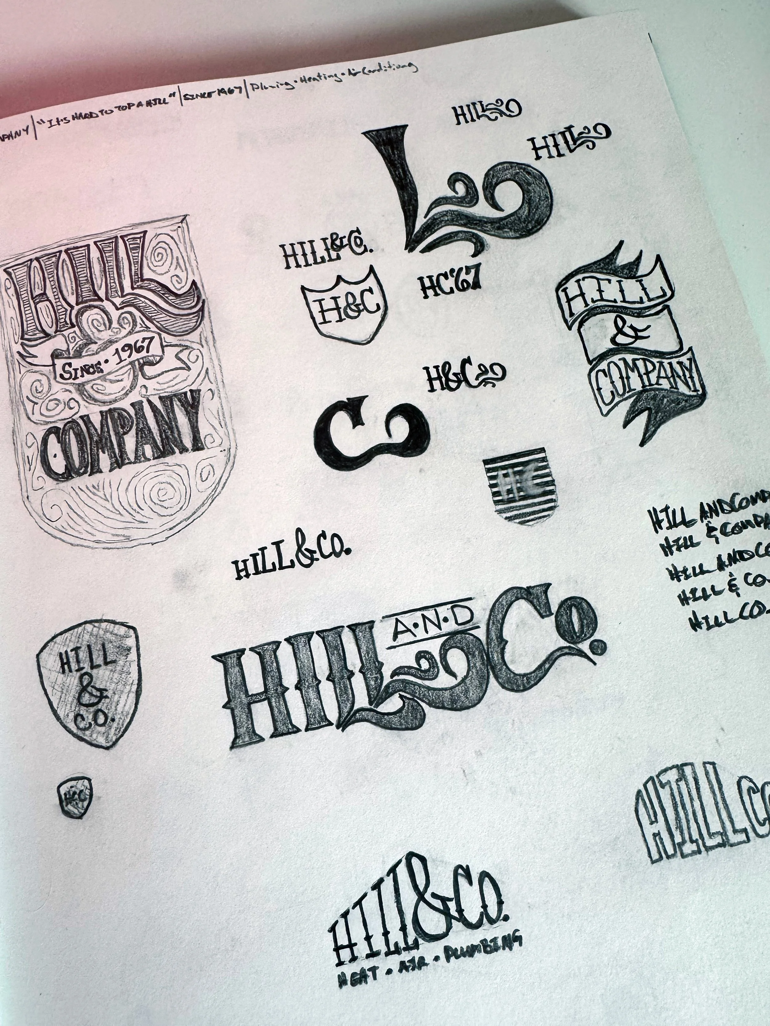
As the designer and creative director leading the rebrand for Hill & Company, an Oklahoma City-based HVAC, plumbing, and electrical firm founded in 1967, the journey began with raw ideation on paper. I started by sketching thumbnails, dozens of them, exploring vintage-inspired shields, swirling scripts, and bold typographic plays that nodded to the company's heritage while pushing toward modernity. These initial doodles captured the essence of "It's Hard to Top a Hill," the guiding tagline, by experimenting with elevation motifs like rising bars and hilly silhouettes. From there, I refined concepts through iterative feedback loops, digitizing promising sketches with modern digital to test scalability and versatility. This phase was crucial for aligning the visual identity with the company's core values: reliability, innovation, and a touch of playful wit that sets them apart in a competitive service industry.
-
![An image of Hill & Company rebrand sketches.]()
Sketches
-
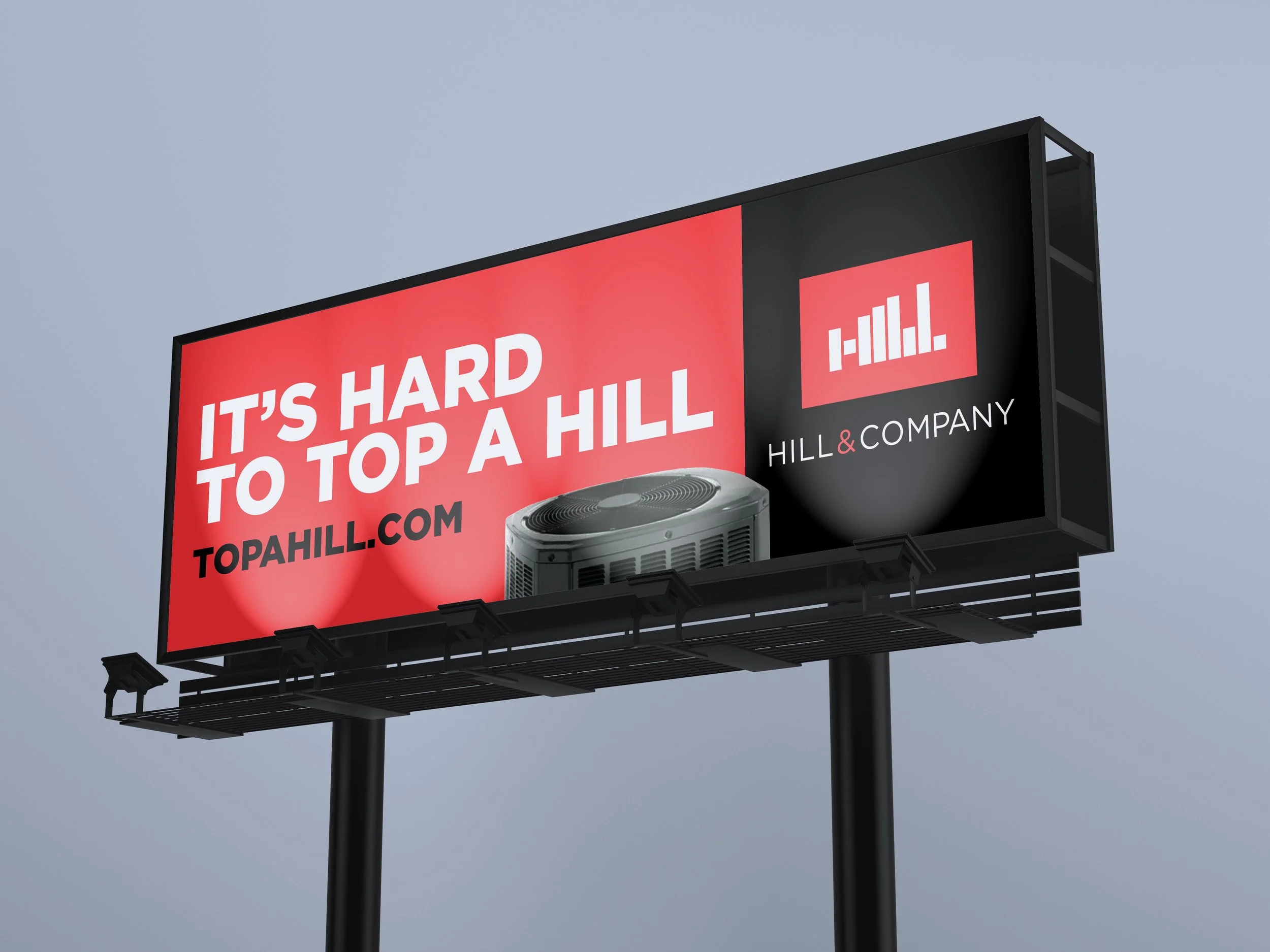
![An image of Hill & Company billboard.]()
Billboard
-
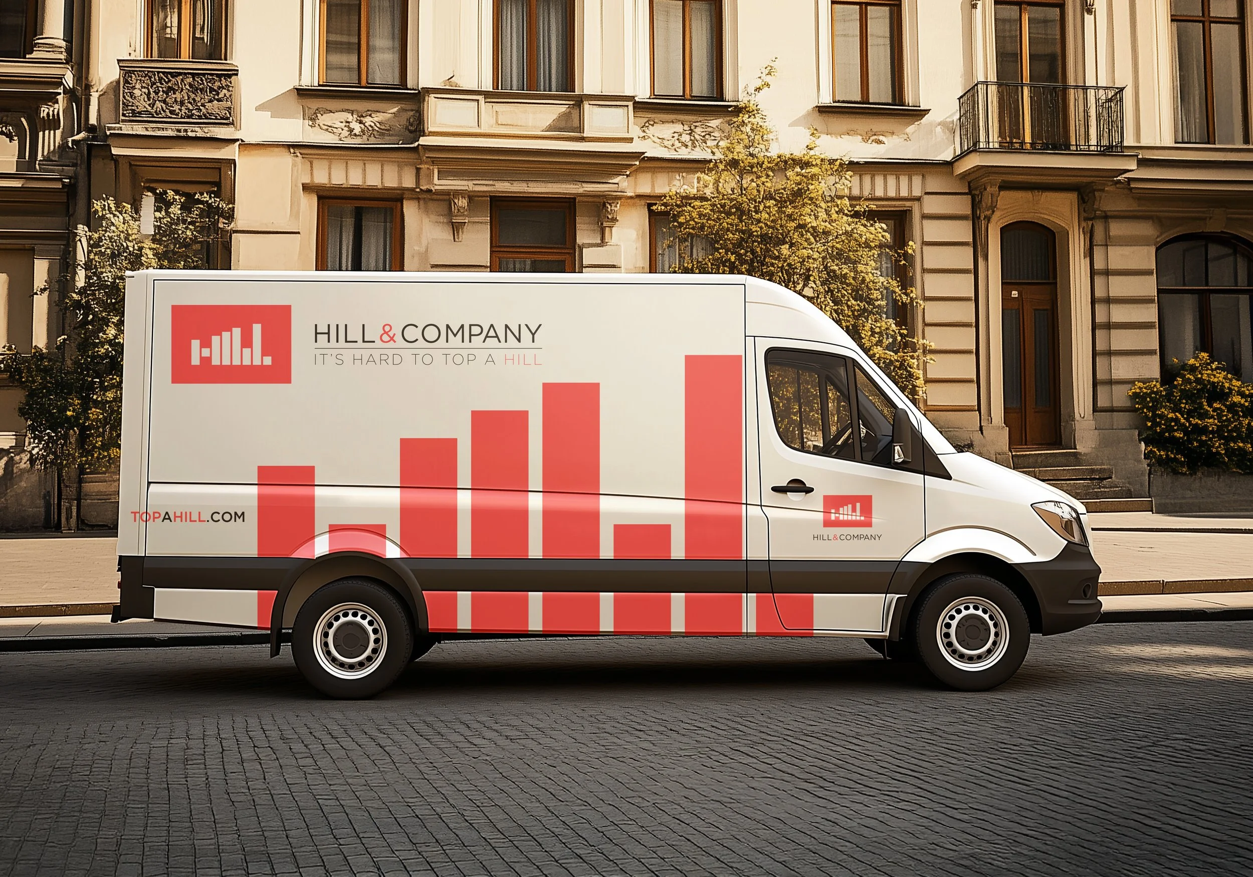
![An image of Hill & Company service van wrap.]()
Wrap
-
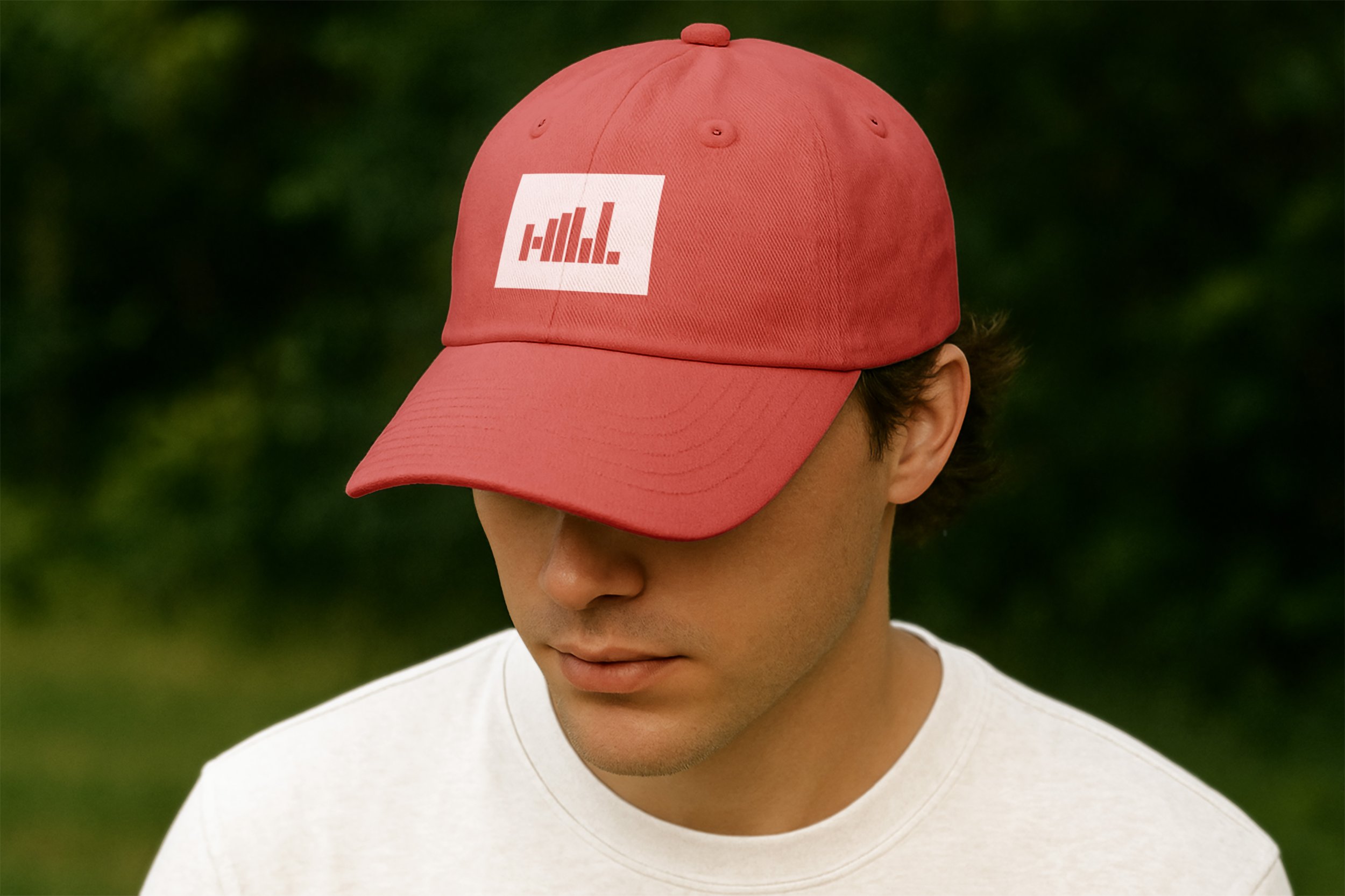
![An image of Hill & Company rebrand baseball cap.]()
Cap
-
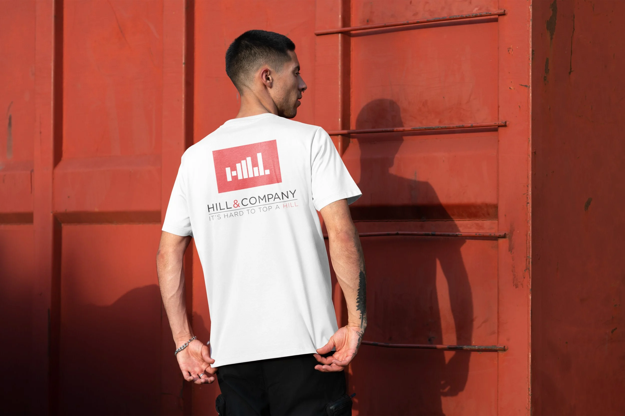
![An image of Hill & Company rebrand t-shirt]()
T-shirt
-
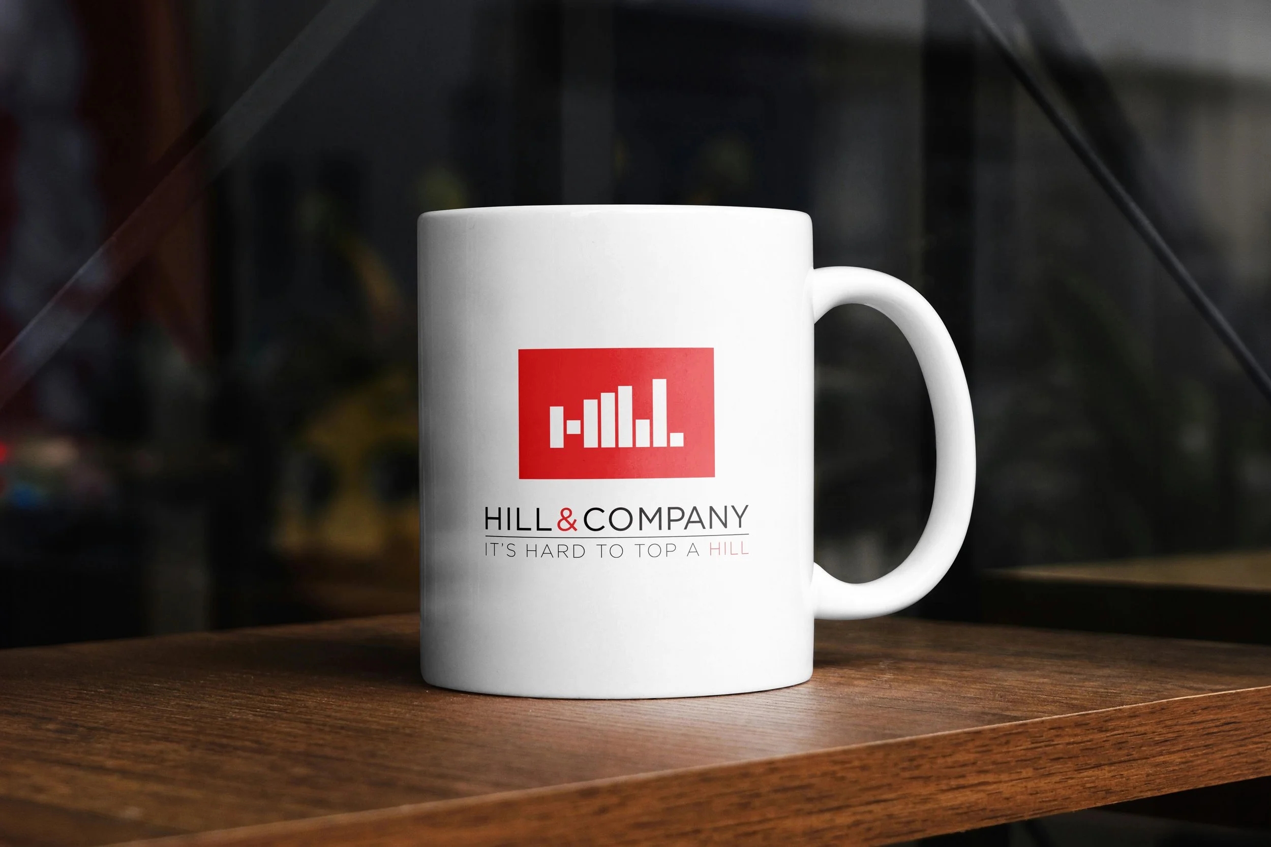
![An image of Hill & Company rebrand coffee mug.]()
Mug
It’s Hard to Top a Hill.
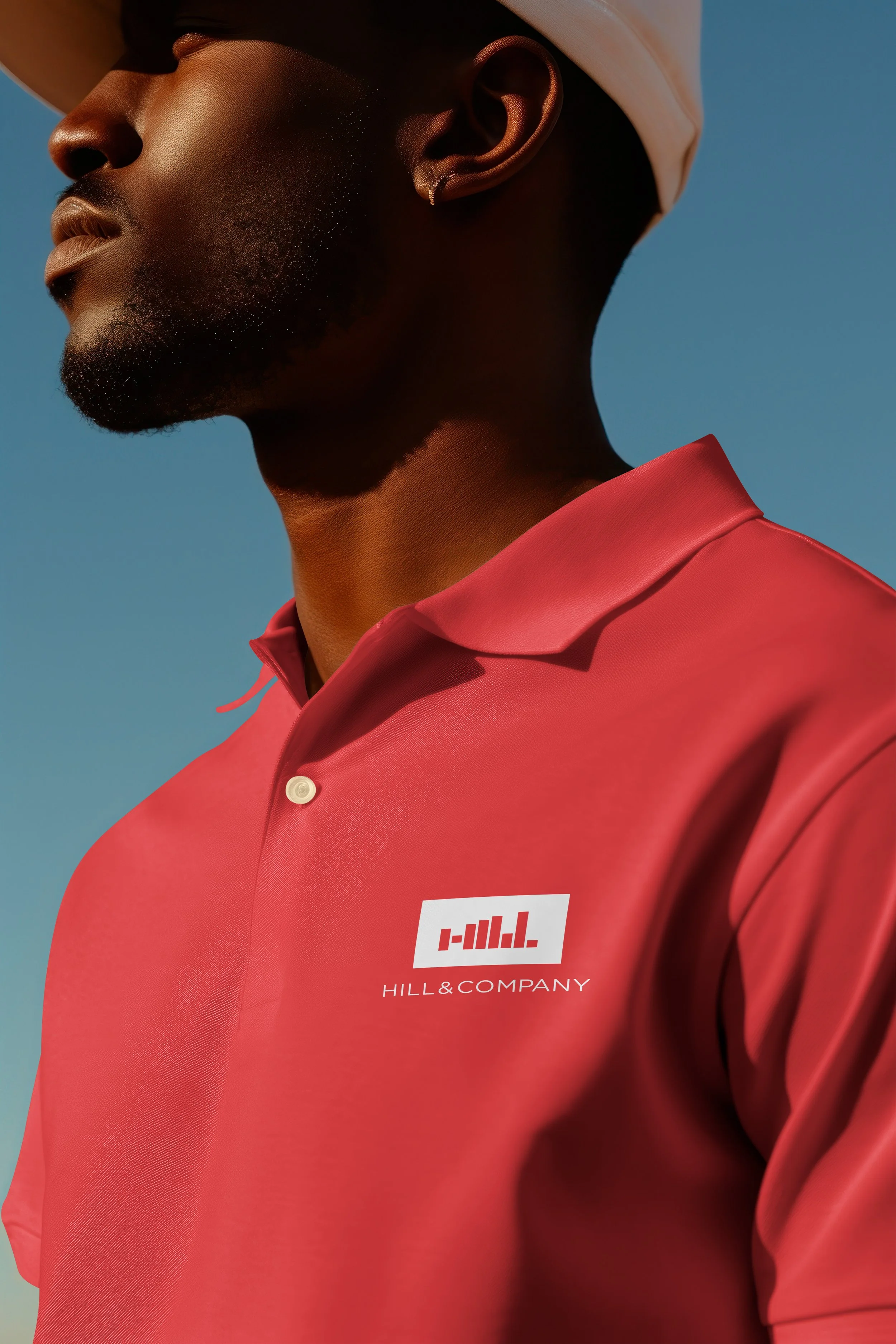
The logo's fruition came from distilling those thumbnails into a sleek, modern mark featuring vertical bars that cleverly spell "Hill" while evoking topographic changes in elevation, mirroring the tagline's pun on topping a hill. I opted for a minimalist red-and-white palette to convey energy and trustworthiness, ensuring the design was adaptable across mediums without losing impact. Graphic design elements extended to a comprehensive corporate identity system, including custom typography that balances bold sans-serif headlines with subtle serifs for a nod to their 1967 roots. This wasn't just about aesthetics; it was about crafting a cohesive narrative that positions Hill & Company as the peak of home services, where every visual touchpoint reinforces integrity and customer-first excellence.
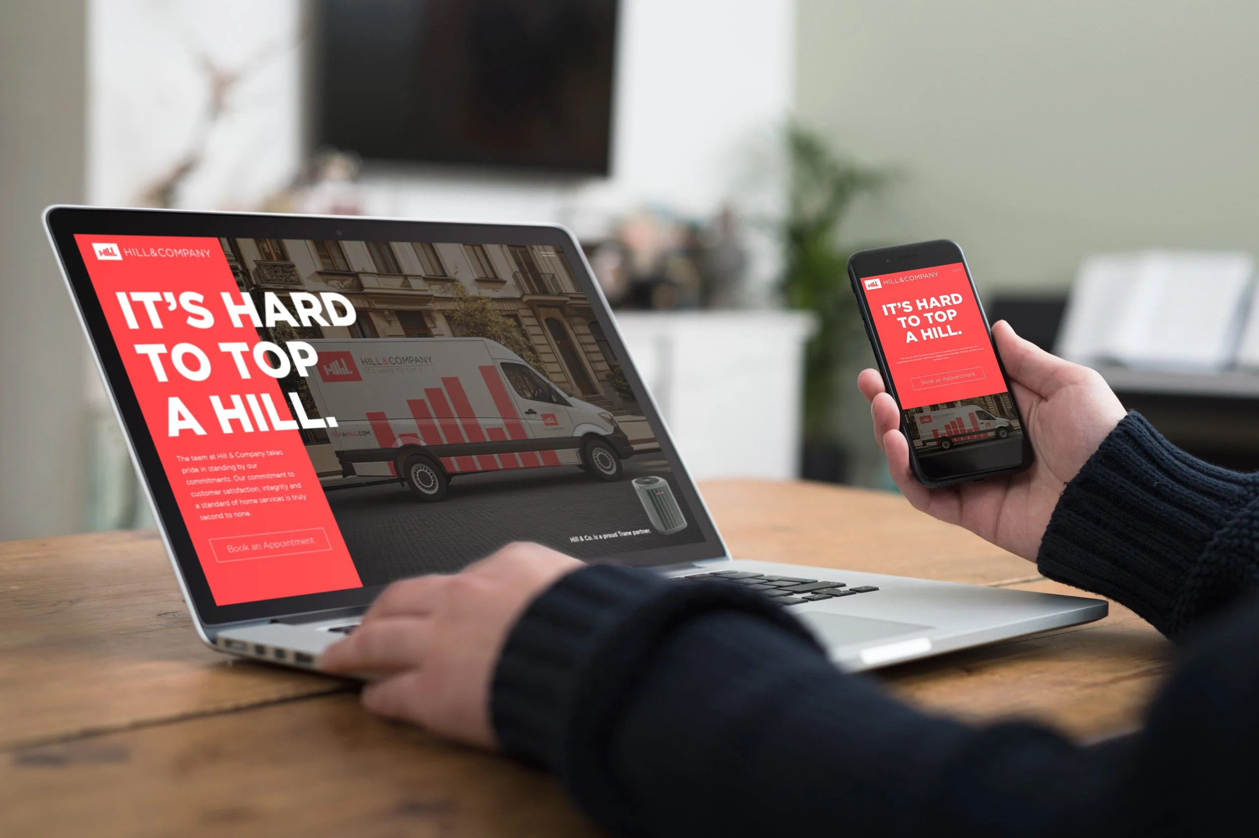
Rolling out the rebrand involved strategic advertising and marketing efforts to amplify visibility in Oklahoma City and beyond. I applied the new identity to high-impact assets like billboards, where the tagline dominates in crisp white against a vibrant red backdrop, paired with an HVAC unit to instantly communicate services. Vehicle wraps on service vans turned everyday routes into mobile ads, with the bar graph logo stretching dynamically across the sides for eye-catching movement. Merchandise like caps, mugs, t-shirts, and polos extended the brand into employee uniforms and promotional giveaways, fostering internal pride and external loyalty. Digitally, the responsive website design integrates the tagline prominently on landing pages, with intuitive navigation that drives appointment bookings, thus boosting online engagement by tying visual consistency to user experience.
Overall, this rebrand has elevated Hill & Company's market presence, blending graphic sophistication with smart marketing to differentiate them in a saturated field. By weaving the elevation theme through every channel, we've created a brand that's not only memorable but scalable for future growth, from local SEO campaigns to community sponsorships. It's rewarding to see the sketches evolve into a living identity that truly tops the competition.