
Wellmark
Oklahoma City, OK
2014
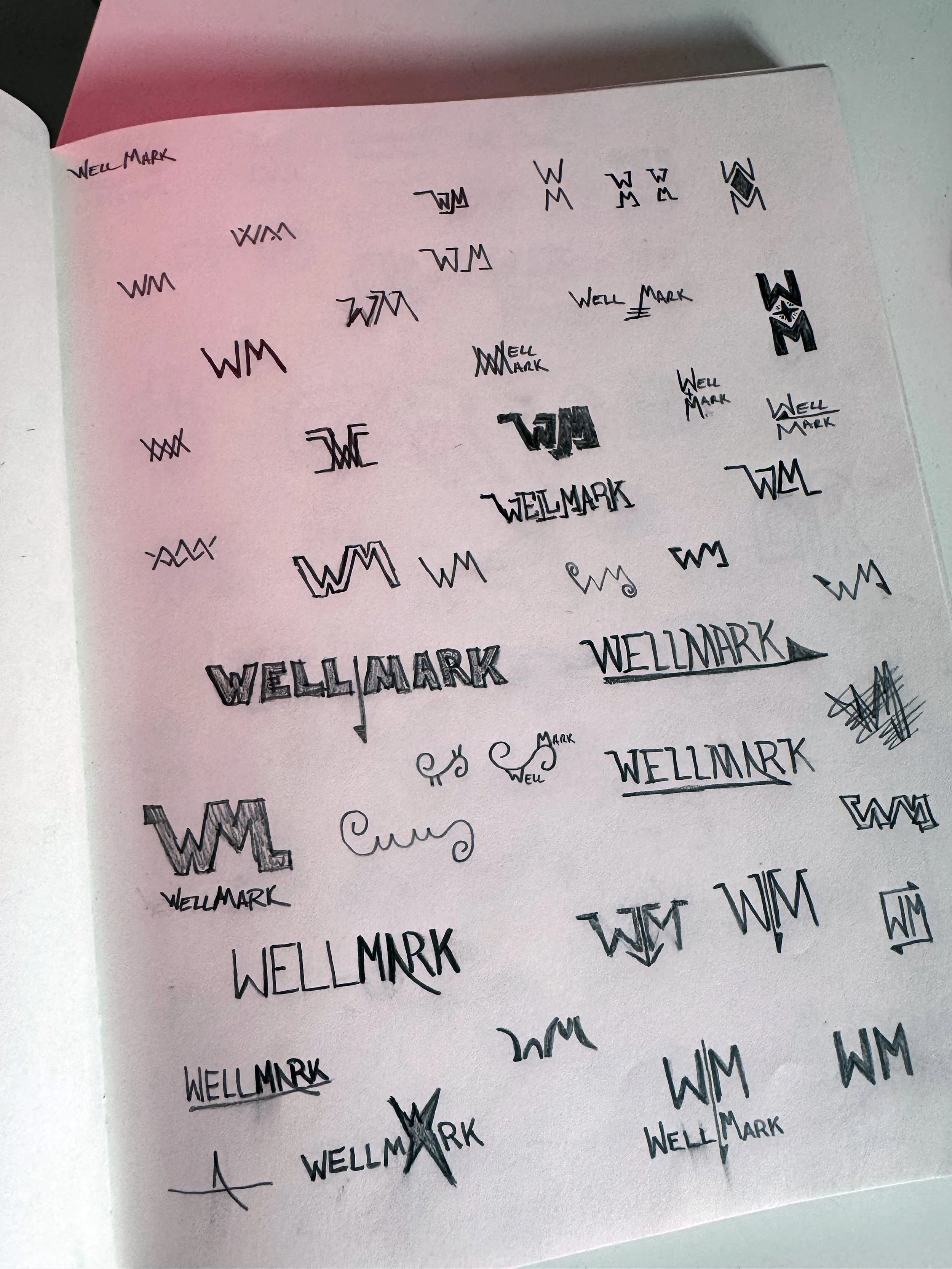
As the creative director at one of my many agencies, I was thrilled to lead the rebranding for Wellmark, an Oklahoma City-based manufacturer of chemical injection pumps, valves, and related equipment essential for upstream and midstream oil and gas applications. The project kicked off with intensive thumbnail sketching sessions, where we explored countless variations of the "WM" initials, drawing inspiration from the coiled springs central to their products. Those early rough, handwritten explorations of shapes like interlocking waves, angular monograms, and fluid scripts really captured the essence of innovation and reliability. We aimed to evolve Wellmark from a traditional industry player into a forward-thinking brand that resonates in a competitive B2B landscape while appealing to shareholders seeking growth and modernity. From those initial sketches, we refined concepts through iterative feedback, ensuring the rebrand aligned with their tagline, "Innovation Out of the Blue," which cleverly nods to unexpected breakthroughs in a sector often seen as rigid and blue-collar as well as their blue pained products.
Innovation Out of the Blue
The B2B branding video showcases the Wellmark's 30+ years of expertise in designing and manufacturing high-quality valves, chemical injection pumps, regulators, controls, and accessory products for the oil and gas industry. It emphasizes uncompromising craftsmanship, innovation over shortcuts, rigorous design and testing processes, environmental responsibility, and outstanding customer service, while highlighting the passionate and integrity-driven people behind the brand as its greatest strength.
-
![An image of sketches of WellMark logo design.]()
Sketches
-
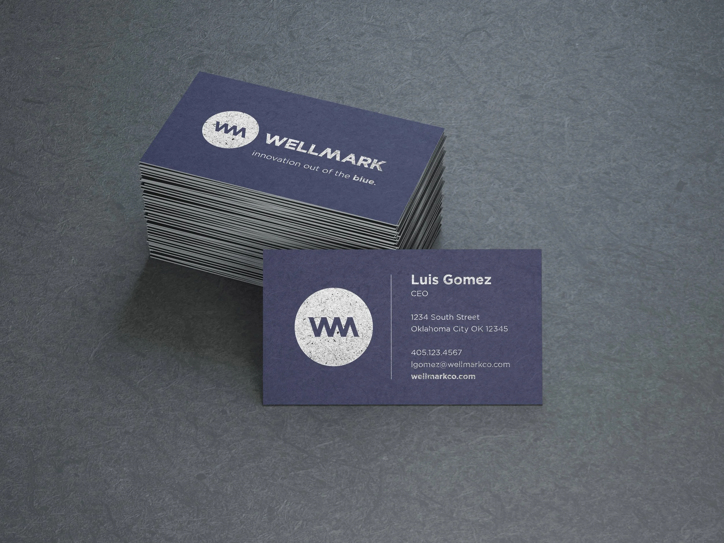
![An image of WelMark rebrand business card.]()
Business Card
-
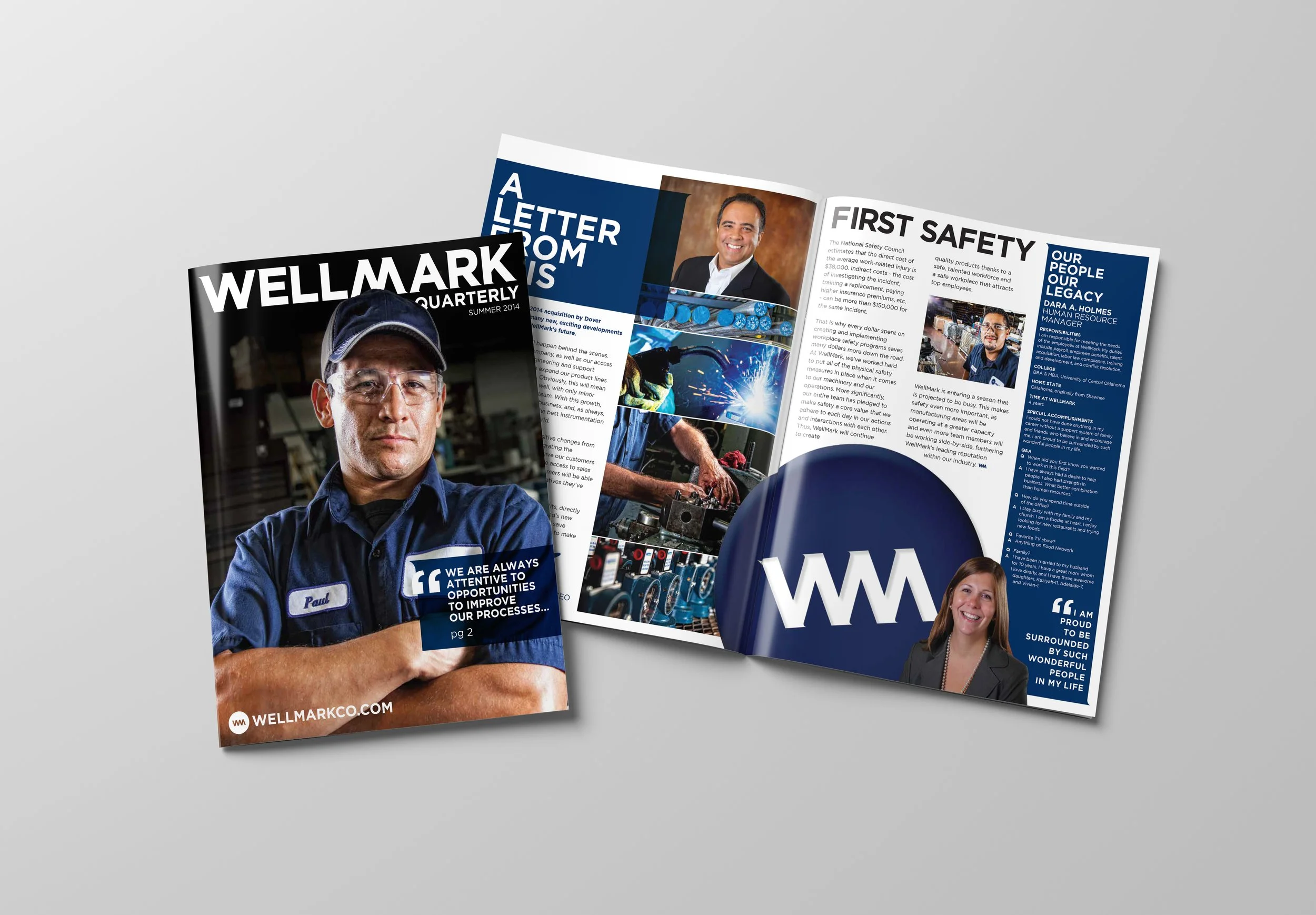
![An image of WellMark newsletter.]()
Newsletter
-
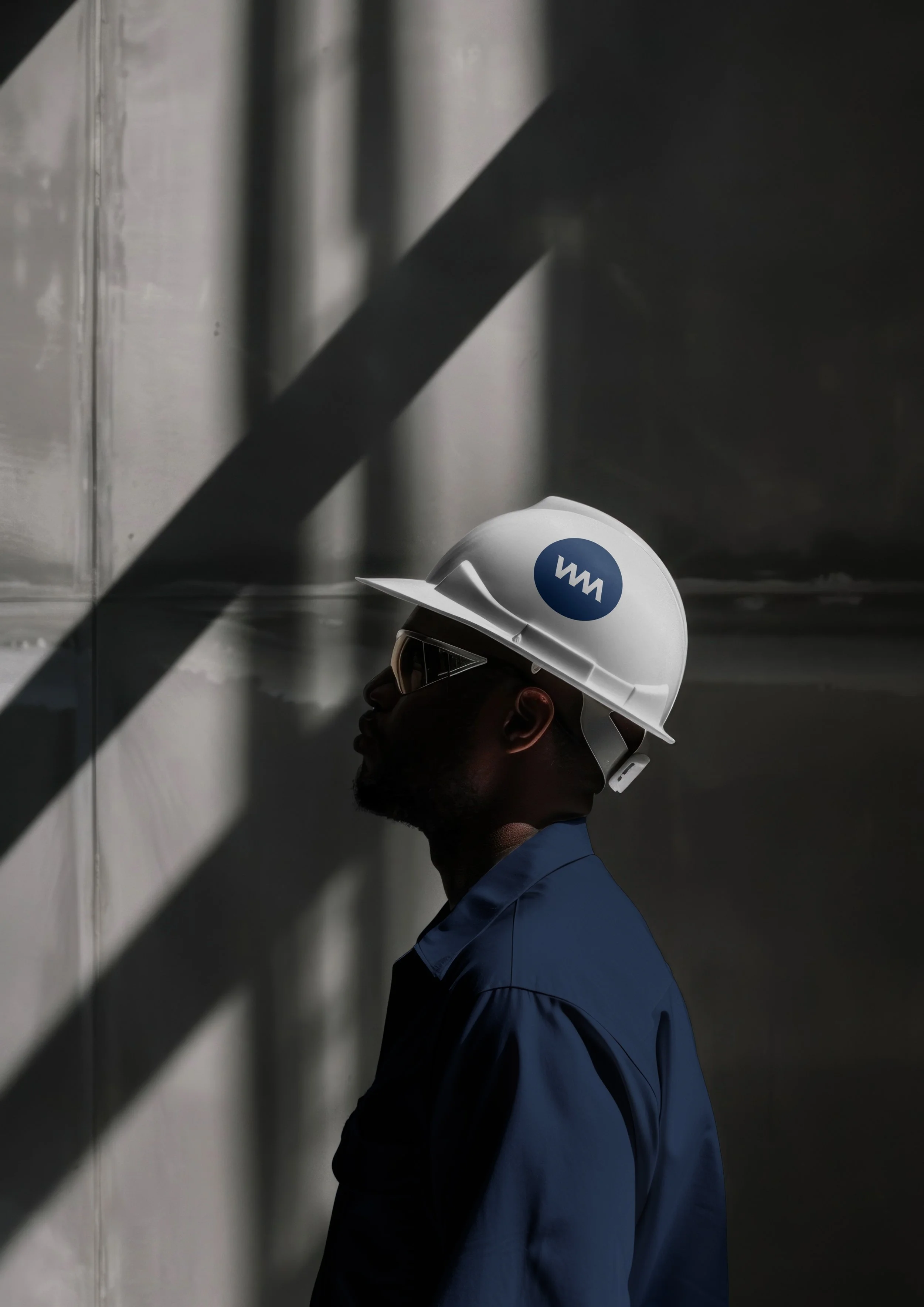
![An image of work wearing WellMark logo icon hardhat.]()
Hardhat
-
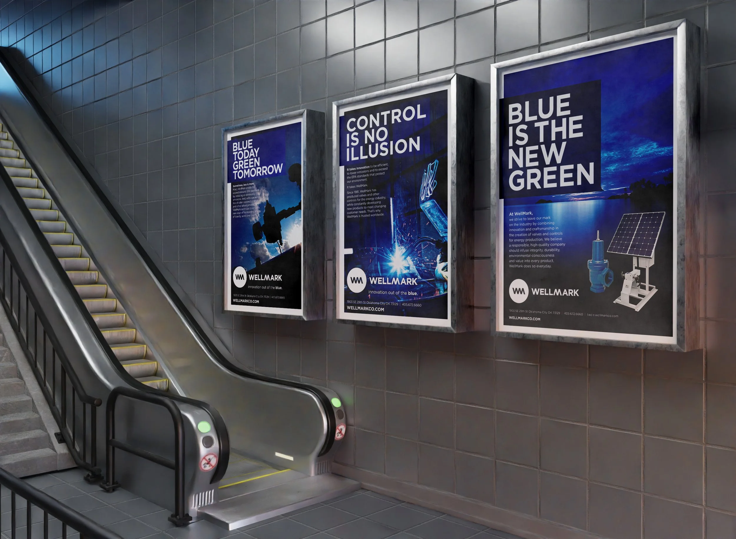
![An image of WellMark rebranding print ads in subway tunnel.]()
Print
-
![An image of a guy wearing WellMark logo icon baseball cap.]()
Cap
-
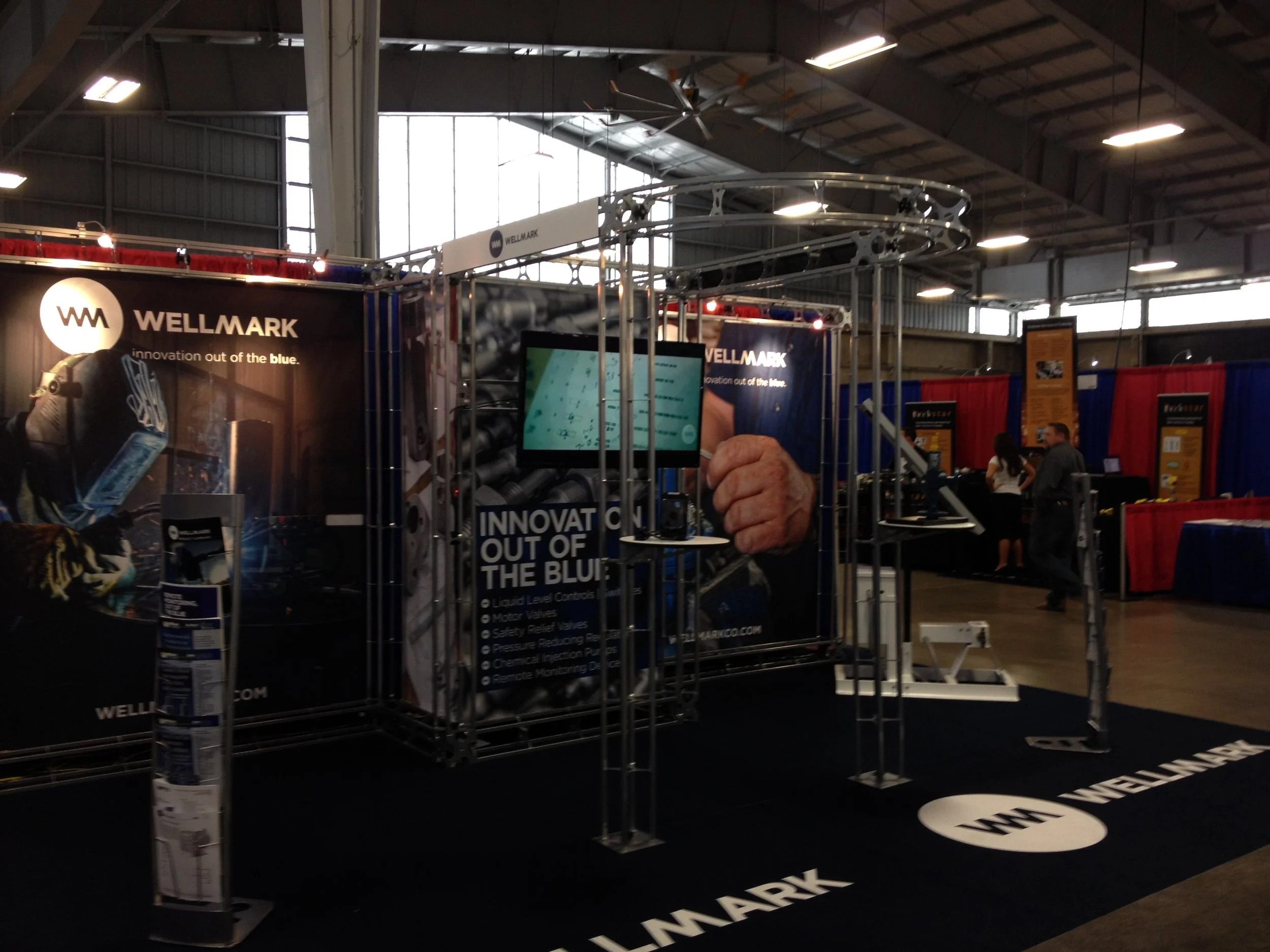
![Wellmark's trade show booth.]()
Trade Show

…innovators in a blue-ocean market, ready to pump new life into the industry.

The fruition of the corporate identity came together beautifully, with the final logo embodying a stylized "WM" that subtly mimics the tension and release of a spring, symbolizing durability and precision in their equipment. We extended this into a comprehensive branding system, including color palettes dominated by deep blues for trust and innovation, paired with gritty, industrial textures to ground the identity in Wellmark's oil and gas roots. Advertising and marketing efforts were tailored for B2B channels, such as targeted LinkedIn campaigns and industry trade show materials, while also crafting shareholder reports that highlighted the rebrand's potential for market expansion. We developed a series of print and digital ads, like the ad posters featuring bold slogans such as "Blue Today Green Tomorrow," "Control is no Illusion," and "Blue is the New Green,'“ that position Wellmark as a leader in sustainable, efficient solutions, blending environmental consciousness with their core products to attract eco-aware investors and partners.
A cornerstone of the rebrand was the website redesign, which we transformed from a static product catalog into an immersive digital experience. The new site opens with a hero section showcasing the logo against dynamic visuals of oil rigs and pipelines, integrated with interactive elements that allow users to explore product specs and case studies seamlessly. We focused on user-friendly navigation for B2B clients, incorporating high-contrast layouts and quick-load animations to emphasize "Innovation Out of the Blue." Complementing this, the general branding video we produced captures the company's ethos through cinematic storytelling, starting with raw footage of Wellmark's actual factory workers and craftsmen manning CNC machines, welding, and sorting inventor, narrated with a voiceover that underscores relentless innovation. The gritty photography style was pivotal here and across all assets as we opted for raw, unpolished shots of workers in hardhats and coveralls amid industrial settings, using dramatic lighting and shadows to convey authenticity and resilience, much like the photo of the engineer gazing into the distance or the cap-adjusting moment that humanizes the brand.
To round out the marketing push, we rolled out collateral like business cards, polo shirts, and quarterly magazines that reinforce the identity with each piece featuring the spring-inspired logo and tagline to create cohesive touchpoints. The B2B focus included customized email campaigns and webinar graphics, while shareholder appeals were enhanced through polished annual reports with infographics tying the rebrand to projected ROI. Overall, this rebrand not only modernized Wellmark's image but positioned them as innovators in a blue-ocean market, ready to pump new life into the industry.