J Gard LLC
Bloomfield, NJ
2019
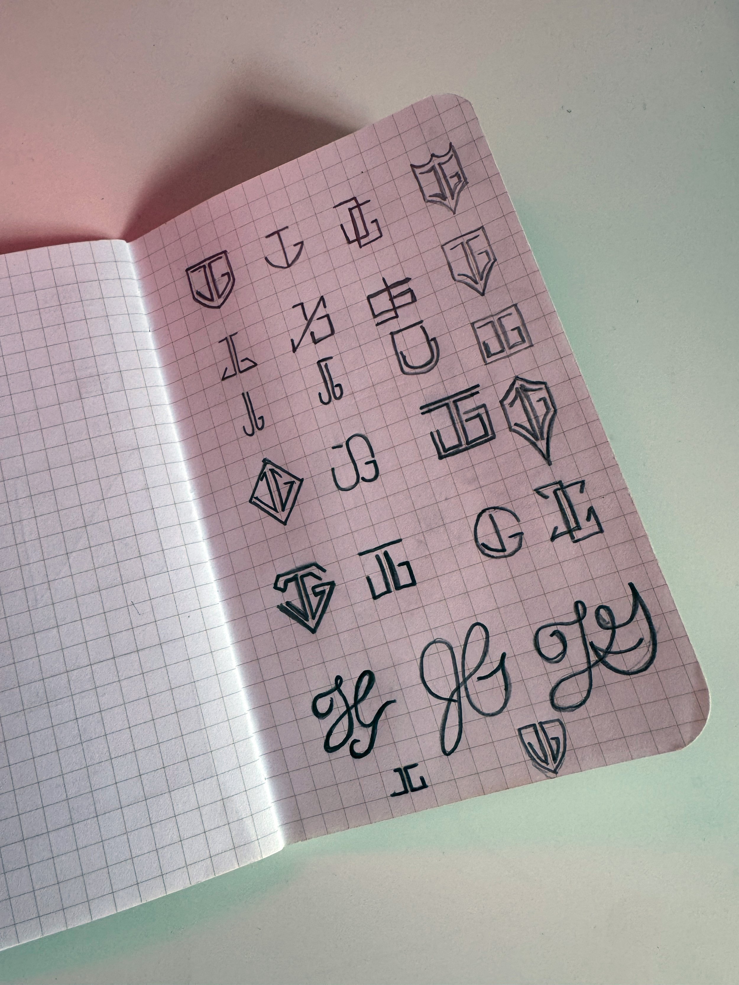
As the creative director overseeing J Gard LLC's rebranding, I couldn't be more thrilled with how this project evolved from humble sketches to a polished corporate identity that truly captures the essence of a company founded in 2010 as a premier contractor for high-end home renovations in New Jersey and New York. It all began with those initial doodles on paper, raw, exploratory ideas where I toyed with geometric shapes, monograms, and shield motifs to symbolize the strength and reliability that Jonathan, the founder and owner, has built his reputation on. These sketches weren't just random, they were a brainstorming session to fuse the initials "JG" into something iconic, drawing inspiration from architectural stability and timeless craftsmanship. In collaboration with the client, we iterated through dozens of variations, from angular lines evoking construction blueprints to more fluid forms that hinted at the artistry in renovations, ensuring the design would resonate with clients seeking luxury transformations.
-
![An image of J Gard LLC rebrand sketches.]()
Sketches
-
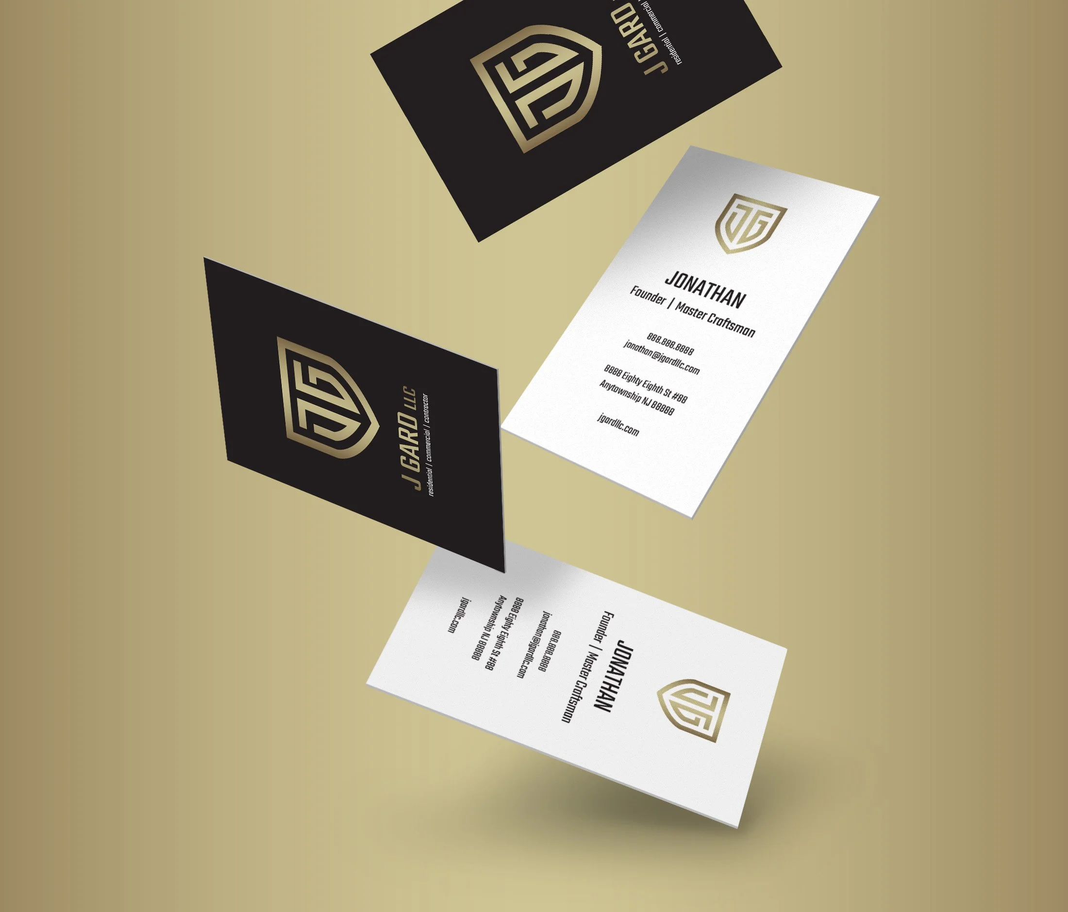
![An image of J Gard LLC rebrand business cards.]()
Business Card
-
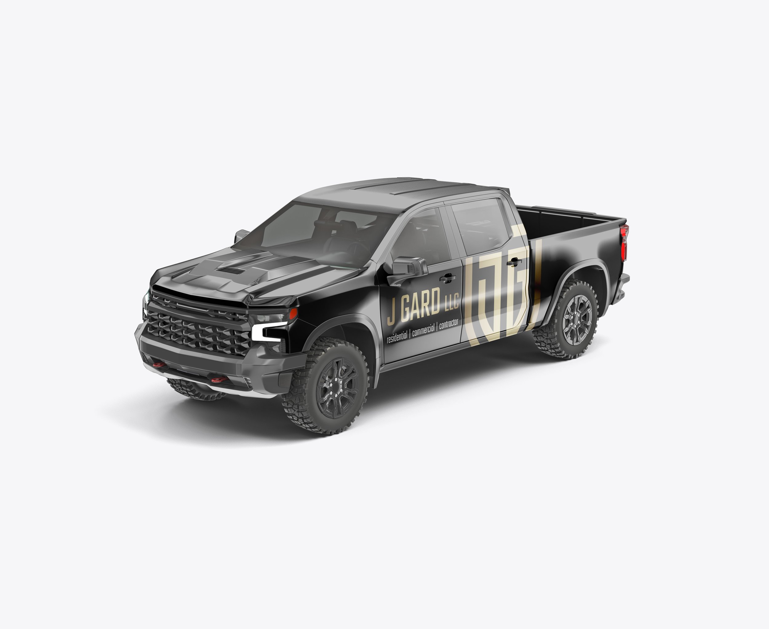
![An image of J Gard LLC rebrand work truck wrap.]()
Wrap
-
![An image of J Gard LLC rebrand baseball cap.]()
Cap
-
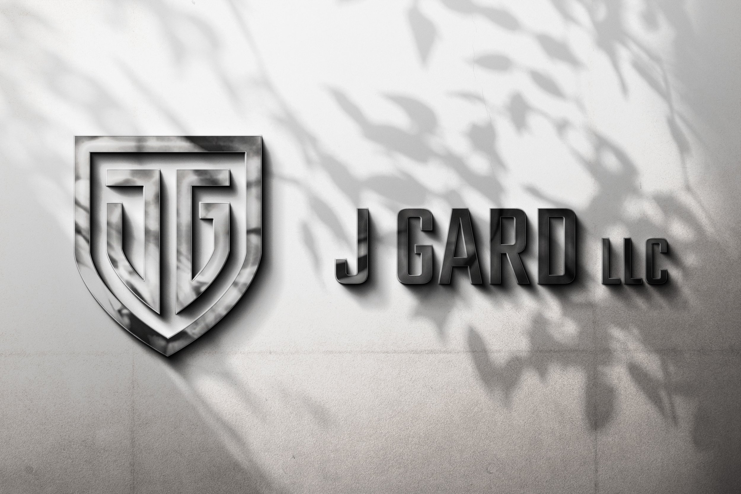
![An image of J Gard LLC rebrand office signage.]()
Signage

This process wasn't solitary, it involved close collaboration with Jonathan to ensure the branding aligned with his identity as a master craftsman…
Bringing the logo to fruition involved refining those sketches into a modern shield emblem, where the balanced "JG" stands boldly for Jonathan's personal touch while embodying the company's core values of strength, stability, and loyalty. The choice of gold as the primary accent color was deliberate, it's not just elegant, but it conveys the high-end taste and class that define J Gard's work, from bespoke kitchen overhauls to full-scale estate remodels. I tested iterations in black and white for versatility, but the gold truly elevated it, making it pop on everything from digital mockups to physical prototypes. This process wasn't solitary, it involved close collaboration with Jonathan to ensure the branding aligned with his identity as a master craftsman, resulting in a logo that's versatile yet distinctive, scalable for any medium without losing its impact.
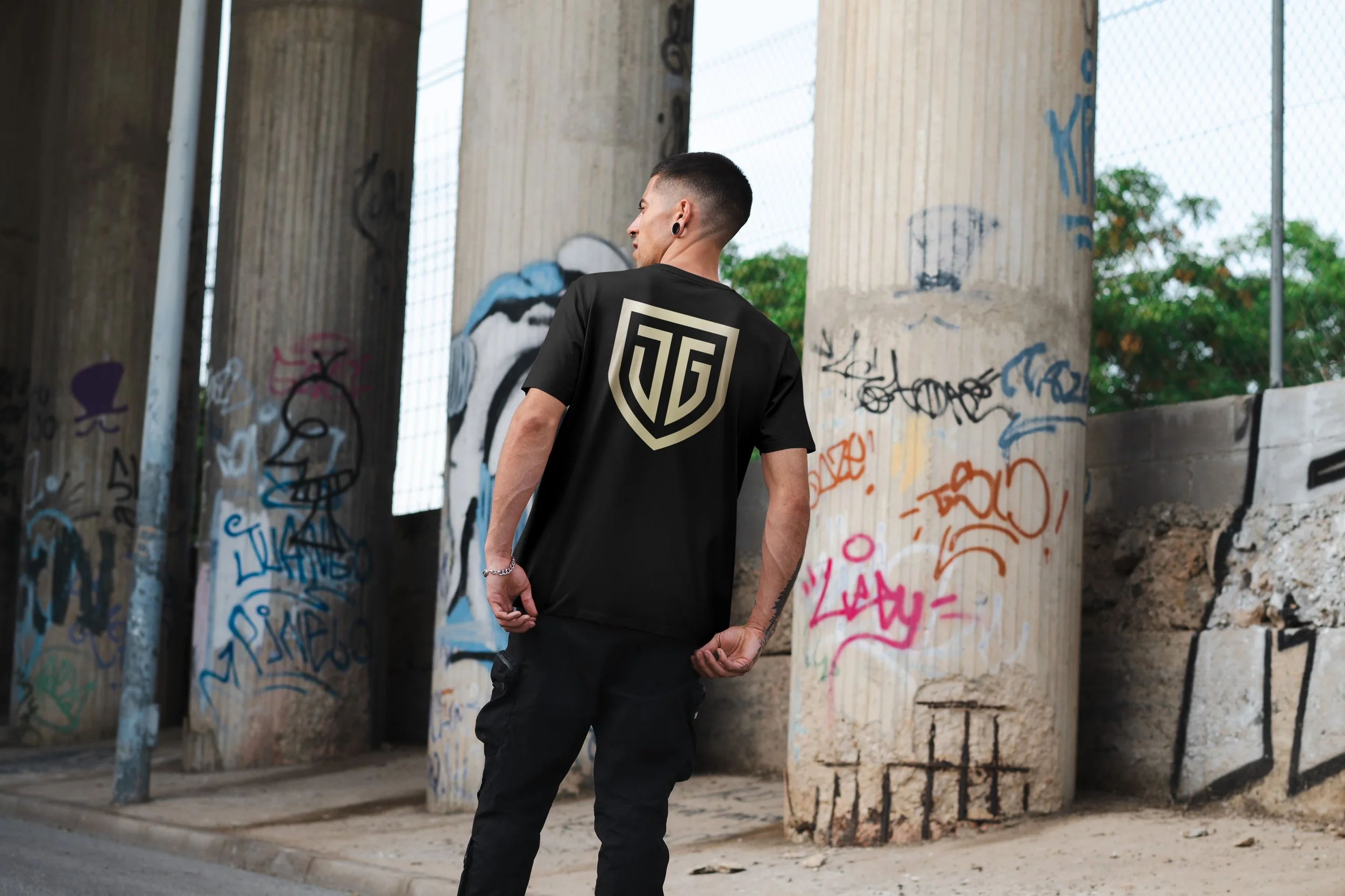
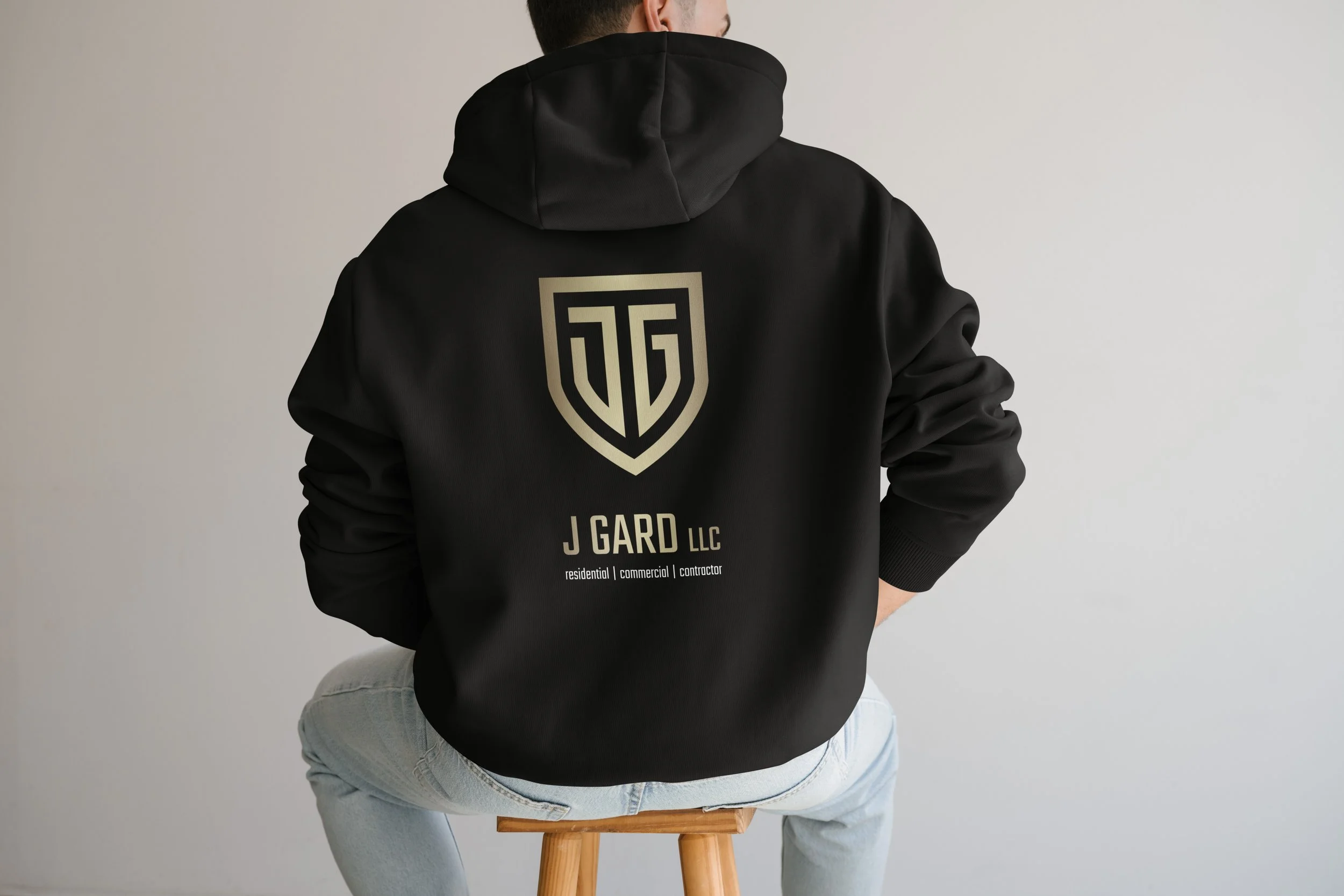
Now, seeing the branding applied across our assets is where the magic happens, business cards that exude professionalism with clean layouts and foil-stamped gold shields, truck wraps that turn the fleet into mobile billboards commanding attention on New York and New Jersey streets, and apparel like hoodies, t-shirts, and hats that the crew wears with pride, fostering a sense of unity and turning employees into walking ambassadors. The signage, with its metallic sheen and bold lettering, reinforces their presence at job sites and offices, creating a cohesive corporate identity that clients associate with quality and trustworthiness. This holistic approach ensures every touchpoint, from a handed-out card to a passing vehicle, tells the same story of excellence.
To amplify this new branding, we rolled out a multifaceted marketing strategy that leverages social media for visual storytelling, think Instagram reels showcasing before-and-after renovation transformations with the logo overlaid, LinkedIn posts highlighting our founder's expertise, and targeted ads on platforms like Facebook to reach affluent homeowners in the tri-state area. Word-of-mouth remains the powerhouse, encouraged through client referral programs where satisfied customers receive branded swag like those stylish hats, turning them into advocates. Combined with updated website graphics and email signatures featuring the shield, this branding refresh isn't just aesthetic, it's a strategic move to build loyalty, attract premium projects, and solidify J Gard LLC's position as the go-to for sophisticated home renovations.