Trident
Clearwater, FL
2023
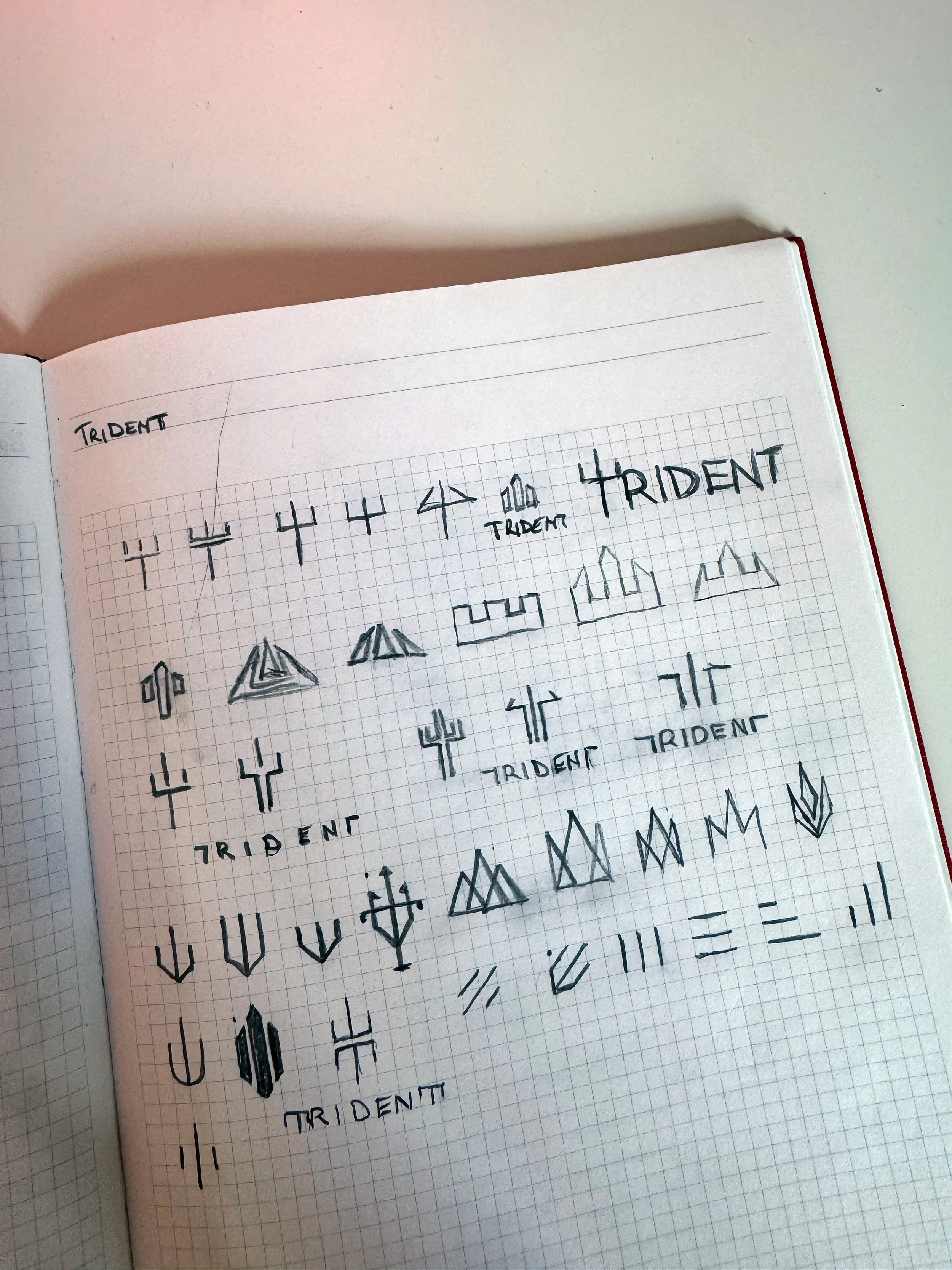
As a hands-on graphic designer with a passion for turning raw ideas into cohesive visual stories, the journey of creating the Trident logo began in my sketchbook, where I always start with thumbnail sketches to capture the essence of the brand. Trident, being a Florida-based marine industry plastics company, evoked images of the sea, strength, and precision…think Poseidon's trident fused with modern industrial resilience. I doodled dozens of variations on graph pages experimenting with stylized prongs, arrows, and geometric forms to symbolize upward growth (like ocean waves rising) and downward stability (anchoring in the depths). The sketches ranged from simple fork-like shapes to more abstract integrations of the letter "T" within a trident motif, incorporating elements like waves or plastic-like fluidity. This phase was all about rapid iteration, scribbling freely to distill the core identity: a symbol that's bold, nautical, and versatile for a company specializing in durable marine plastics. Florida's coastal vibe influenced subtle nods to blue hues and clean lines, ensuring the design felt rooted in the Sunshine State's watery landscapes.
-
![An image of Trident Marine Industry Plastics logo design sketches.]()
Sketches
-
![An image of girl wearing Trident Marine Industry Plastics bucket hat.]()
Bucket Hat
-
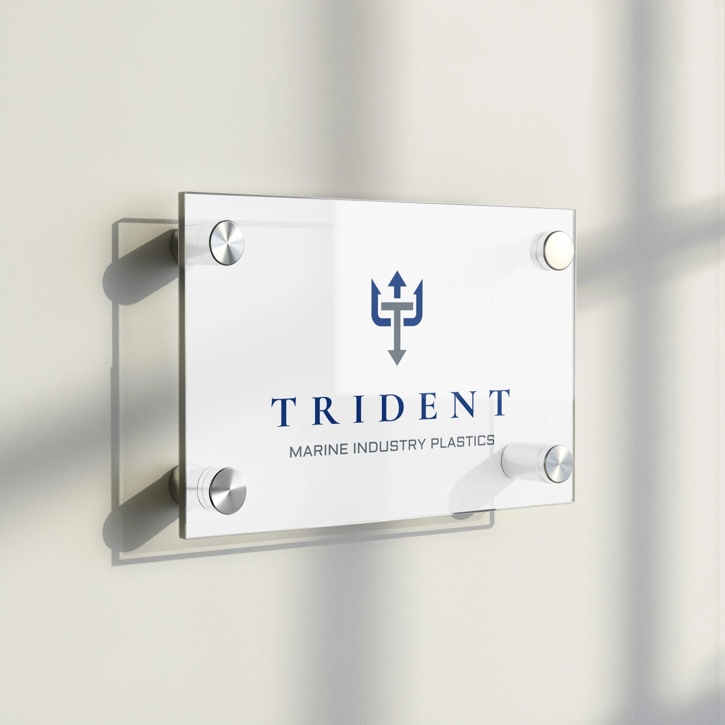
![An image of Trident Marine Industry Plastics corporate office door signage.]()
Signage
-
![An image of a Trident Marine Industry Plastics icon golf ball teed up.]()
Golf Ball
-
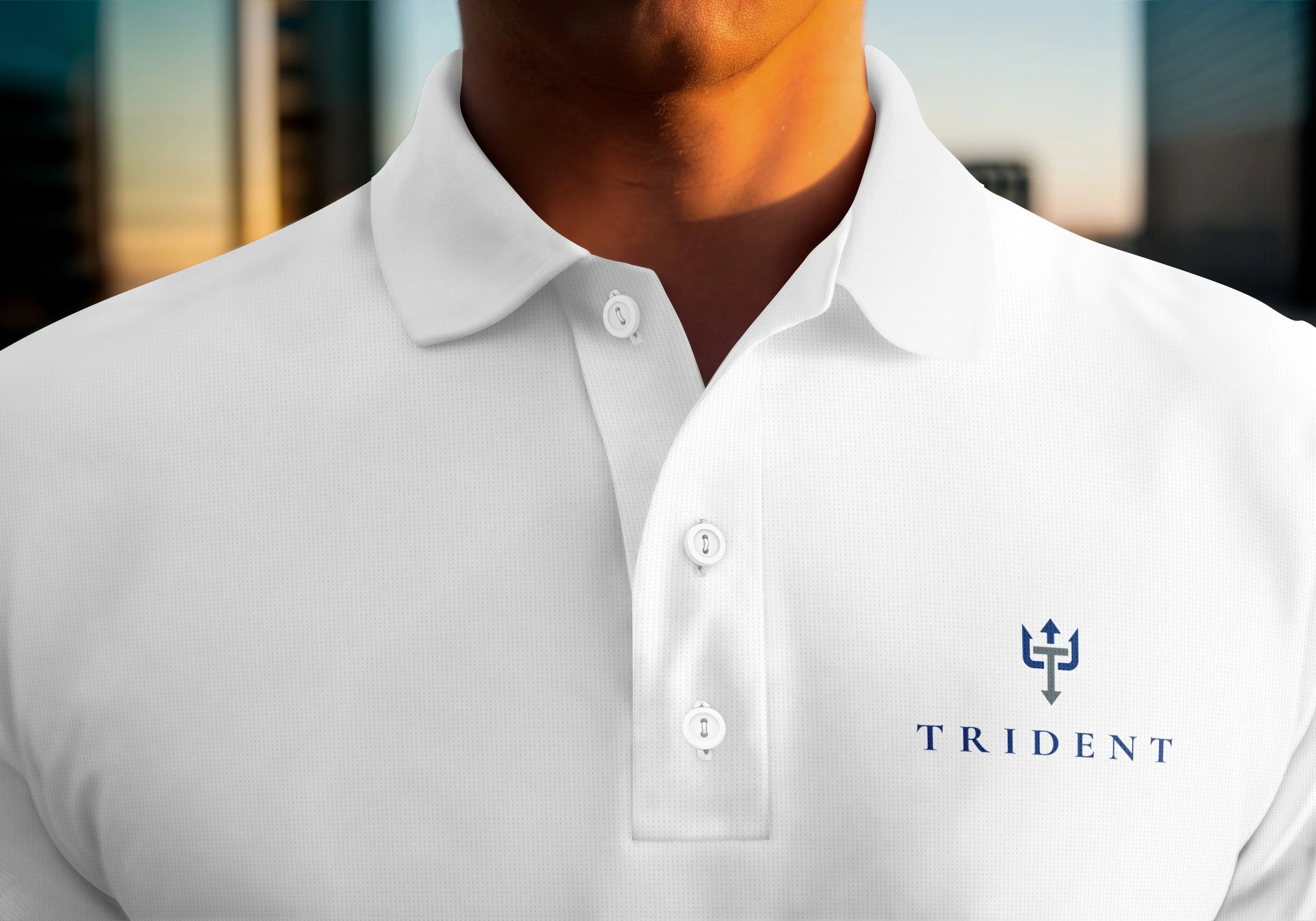
![A guy wearing Trident Marine Industry Plastics logo polo.]()
Polo


A narrative of Florida's maritime heritage blended with cutting-edge plastics technology.

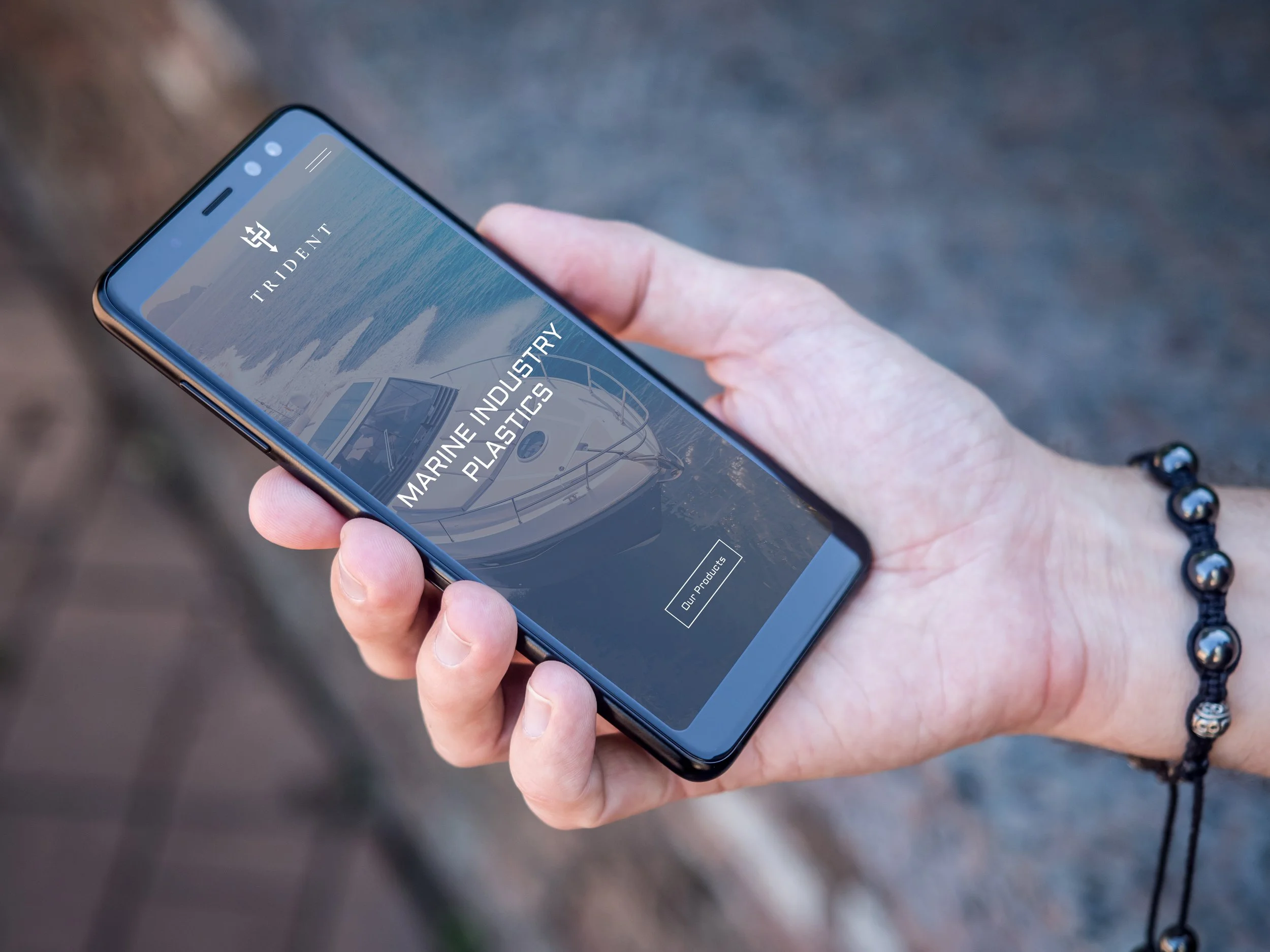
Moving from sketches to digital refinement, I digitized the most promising thumbnails using Adobe software, focusing on balance, scalability, and symbolism. The final logo emerged as a sleek, symmetrical trident incorporating an upward arrow for innovation and a downward one for reliability, all unified in a minimalist trident inspired form with a central "T" crossbar. I chose a royal blue for the primary color to echo the ocean depths, paired with grayscale accents for adaptability across materials. This graphic design process wasn't just about aesthetics, it was about crafting a corporate identity that communicates Trident's expertise in high-performance plastics for boats, docks, and offshore applications. I tested iterations for versatility, ensuring the logo scaled well from small icons to large formats, and incorporated feedback loops to align with the company's values of durability and environmental stewardship in Florida's marine ecosystem.
Bringing the logo to fruition involved extending it into comprehensive branding efforts, transforming it from a static symbol into a living corporate identity. I applied it across merchandise like polo shirts, sweatshirts, bucket hats, and even golf balls, perfect for networking in Florida's golf-loving business scene, using embroidery and screen printing techniques for a premium feel. Digital applications included website headers and app interfaces on smartphones, where the logo's clean lines ensured quick loading and mobile responsiveness. Physical signage, such as acrylic wall plaques, reinforced the brand's presence in offices and trade shows, with frosted glass effects mimicking ocean mist. These branding initiatives went beyond graphic design, they built a unified ecosystem that positions Trident as a forward-thinking leader in marine plastics, fostering customer loyalty through consistent visuals that evoke trust and innovation. Every application was prototyped hands-on, from mockups on apparel to 3D renders for signage, ensuring the identity resonates across touchpoints.
Ultimately, this project solidified Trident's corporate identity as more than a logo, it's a narrative of Florida's maritime heritage blended with cutting-edge plastics technology. By starting with humble sketches and evolving through meticulous design and branding, in collaboration with the client, we created an emblem that's not only visually striking but also strategically aligned with the company's mission, helping it stand out in a competitive industry.